
Web Discovery & Redesign for Internal Shared Resources Tool
Business Overview:
Fred Hutch is a cancer research center dedicated to the elimination of cancer and related diseases. Shared Resources is a tool that is intended to be a database for researchers to utilize and reference.
Problem Statement:
The Shared Resources tool had been contributed to over the course of ten years without experience considerations, causing usability issues for both internal and external researchers.
Business Goals:
Increase site utilization from internal and external researchers to become a more trusted and reliable resource. Improve admin experience for internal users. Improve donors experience in order to continue to receive charitable monetary contributions.
Process & Deliverables:
Stakeholder Research
User Research
Competitive Analysis - Feature & Experience
User Research
Personas
User Scenarios
User Journeys
Wireframes
Tools Used:
Pen & Paper
Google Meet, Drive, Docs, Sheets
Sketch & Figma
inVision
My Role:
Lead UX Designer
Starting Point
Stakeholder Interviews
I interviewed 9 individuals from Fred Hutch ranging from the director of operations, staff scientists, shared resources admin, and scientific directors in order to understand project priorities, goals, understood opportunities, competitors and vision. My findings included:
Users - Users include labs, grant administrators, pharmaceutical companies, PhDs, or faculty recruits.
Varied User Needs - Each core has strongly varying needs, and requires various functionality to be successful in their unique practice category.
Content Organization - Even users who are familiar with the site prefer not to use it because they cannot easily locate and save content, causing users to bypass the site, and contact an admin directly.
Tell the Story - The current site does not inspire, as it does not showcase the cutting-edge, breakthrough science the Shared Resource cores deliver.
Backend Upkeep - Utilize a backend system that employs regular maintenance.
User Interview Findings
I interviewed a total of ten users of the Shared Resources site and consolidated findings by way of an affinity map in order to categorize common categories & pain points. Findings include:
• Vague Page Details - Pages do not effectively share enough detail.
• Users Bypass Site - Many users will bypass the site and look for alternate options to achieve their goals.
• Time - It is especially important for all users to efficiently access content.
• Site Awareness - Both internal and external users indicated that site awareness is low. Some users stated that the nomenclature is confusing - “Shared Resources” doesn’t indicate the intended use for the site.
• Content Organization - Content lacks organization and hierarchy.
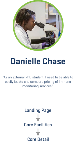
• Secure Content / Pricing - Currently, pricing is not included and was said to be crucial in order for researchers to be efficient with their time.
Personas
“My time is so limited I can’t afford to spend ten minutes looking for anything on the site. I usually just call and ask the lab. It’s usually more accurate anyway. ”
“I usually just use resources that I know I can navigate quickly and find what I’m looking for. Salk and MD Anderson are my go-to’s.”
“I feel so passionately about the work that we do here. I would love for the site to play more of an instrumental role in our and other institutions research. ”
“I spend a lot of time learning about different cancer research institutions. I want to see stories being told and outcomes. That’s what I can identify with. ”
Competitive Analysis - Features
Opportunities were distilled from a feature analysis looking at Fred Hutch and similar institutions. The categories examined were high-priority issues mentioned during the user & stakeholder interviews. Areas include:
• Relationship to other Fred Hutch sites is unclear and undefined
• The indented use of the site is not clearly enough defined
• Naming conventions within Core Facilities and Services are unclear
• Links are vaguely titled and redundant
• Provide more detail within services offered. Opportunity to include pricing, who will be involved, location of lab, time estimation, etc…
User Journeys & Associated Scenarios
Prototypes
I created Individual prototypes per each unique user flow.


Before
After
Outcomes & Metrics
• 39% (average) Increase in site usage and decrease in calls to facilities from external users
• Internal users able to find the category of content they are looking for
• Recognizable language incorporated - “Cores" for Researchers, “Donate Now” CTA for philanthropists
• Content organized in a discoverable and understandable way (sub navigation)
• Shared Resources link now lives in primary navigation as well as footer
More Case Studies

Employee Benefit Platform For Healthcare Provider
Client: First Choice Health

Web Redesign Focused on Tech Replatform & Integration
Client: Zemax

Web Discovery & Redesign
Client: Swiss Water

Flight Itinerary Unification
Client: Expedia

Web Discovery & Recommendation Backlog
Client: SanMar

Woodworking
Check out some of my personal projects