
Web Discovery & Redesign Overview
Business Overview:
Swiss Water is a Canadian company that uses a proprietary process using only water, temperature and time to naturally decaffeinate coffee.
Problem Statement:
Swiss Water’s web experience had become bloated and was unsuccessfully serving several different audiences including global customers, roasters, trade customers, internal teams, and investors alike.
Business Goals:
Increase site engagement for coffee customers. Optimize experience and allow for self-service for trade partners. Increase revenue.
Process & Deliverables:
Stakeholder Research
UX Audit
Competitive Analysis
User Research
Personas
Content Strategy
Wireframes
Tools Used:
Pen & Paper
Google Meet, Drive, Docs, Sheets
Sketch & Figma
inVision
Zeplin
My Role:
Lead UX Designer
Starting Point
Stakeholder Interviews
I interviewed 9 individuals from Swiss Water ranging from the CEO, marketing managers, International VP’s, sales directors, to the VP of trading in order to understand project priorities, goals, understood opportunities, competitors and vision. My findings included:
Navigation / information architecture: Rethink site mapping and logic flow for content, navigation and usability.
Content organization and integration: Lay the groundwork to help Swiss Water clearly communicate their value adds and resources for visitors who are interested in learning more, partnering, or purchasing.
Address trade vs consumer needs: Create more distinction and clarity between the trade, consumer, and investor content and pathways.
Design: Design should build upon the existing Swiss Water look and feel, refining and expanding it where appropriate.
UX Audit Takeaways
• Navigation was bloated and clunky
• 5 different sites without unification
• Unclear which content was for customers vs roasters
• Unclearly labeled and redundant CTA’s
• Unclear value proposition
• Lacking credibility/testimonials
• Shop was difficult to find and difficult to use once found
Competitive Analysis
I conducted a competitive analysis to dive one level deeper into identified opportunities and compare execution from competitors. It was important to be considerate of global customers, trade users, and roasters. Primary categories examined & takeaways included:
Homepage:
A clear and succinct value proposition is impactful. Large imagery and especially video tends to be a popular method of storytelling on home. Thrive has two calls to action to immediately funnel visitors down distinct paths depending on their needs: Learn vs Shop.
Navigation:
Surfacing categories that help guide users to content they are seeking.
Calls To Action:
To help guide the user in their decision making on the site, these examples give a clear example of what to expect when engaging with content.
Process:
Effective approaches include imagery and/or illustrations, digestible headlines and copy, sometimes video. Hierarchy of information is also important in telling the process story.
Value Add:
Commonly used approaches to communicating the benefits include: list of benefits, testimonials, interactive and expandable content.
Credibility:
Prominent certifications, testimonials, and displaying partners/customers are all common approaches for adding to brand credibility.
Why Care?:
These examples help draw connections between the customer and the impact of their choice. Fair trade also uses compelling statistics for trade/business value.
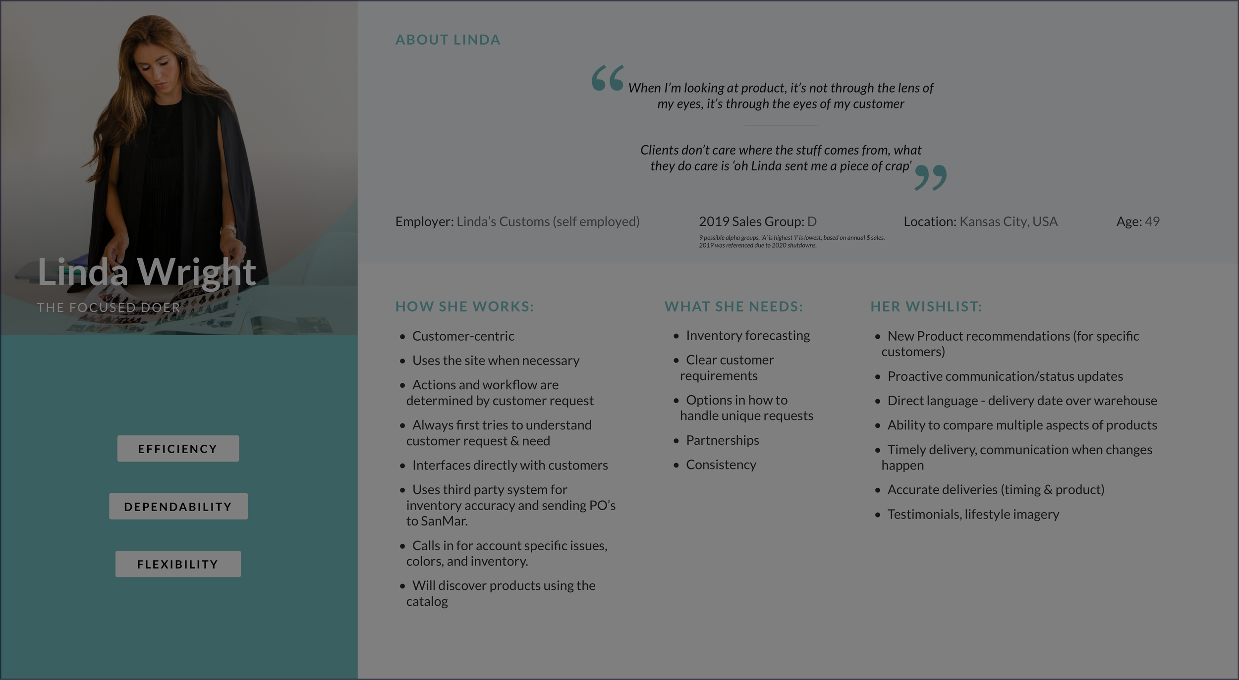
User Interviews & Personas
I interviewed a total of 12 users ranging in categories from trade customers to coffee enthusiasts. What I learned:
“I love Swiss Water. They add immense value to my company, but the online experience is always a struggle. I just want to be able to find my stuff and send it to my customers”
“Swiss Water is the best! I have severe reactions when I drink caffeine, so I always remember to order it when I’m about to run out. Well, almost always... ”
“I didn’t even know there was a healthy way to make decaf. I thought it was all the same. ”
Content Strategy
Creating a discovery flow and sitemap helped communicate unique goals per user group to Swiss Water stakeholders and would serve as a jumping off point for how we can best serve each group simultaneously within my wireframes.
Wireframes
My wires went through 3 rounds of iteration throughout the project. My priorities & key screens in the experience are included below and all wireframes can be found here.
• Ensuring navigation CTA’s help customers & trade users find & access the content they were looking for.
• Coffee Quiz (to encourage engagement with shopping experience)
• Shop & cart experience (login/purchasing flow)
• Trade user login
• Investor Relations
Home
Trade Landing Page
Trade Logged-In
Shopping Experience (secondary nav introduced)
Cart Experience
Checkout
Consumer Dashboard
Consumer Subscription Experience
Before
After
Outcomes & Metrics
• Shopping experience incorporated and subscriptions increased 20%
• Increased engagement in trade portal, shop, and investor relations
• Additional project was initiated based on research
• CTA’s consolidated & clearly defined
• Value proposition clearly stated upon landing
More Case Studies
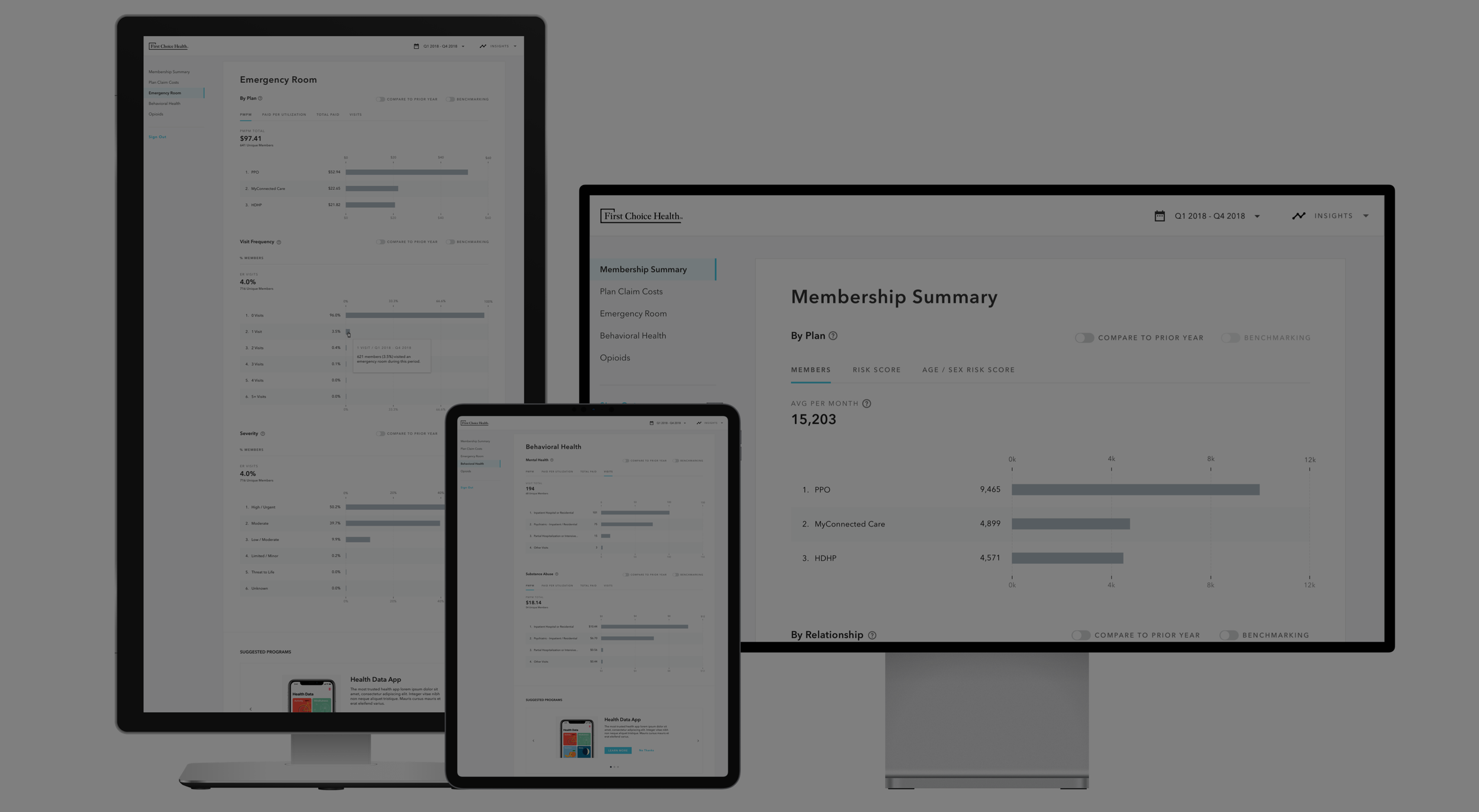
Employee Benefit Platform For Healthcare Provider
Client: First Choice Health
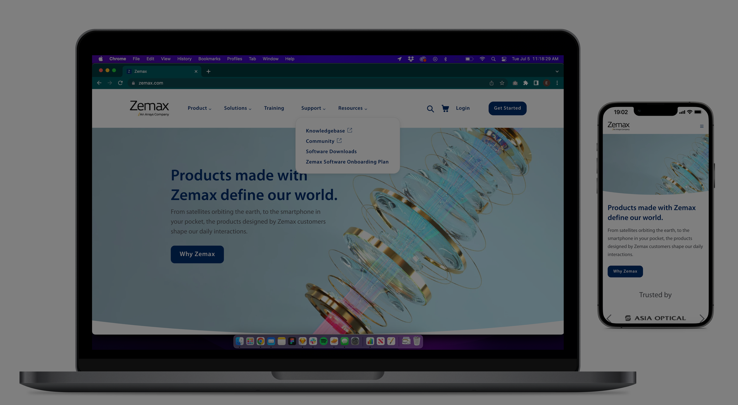
Web Redesign Focused on Tech Replatform & Integration
Client: Zemax

Web Discovery & Redesign for Internal Shared Resources Tool
Client: Fred Hutch

Flight Itinerary Unification
Client: Expedia
Web Discovery & Recommendation Backlog
Client: SanMar

Woodworking
Check out some of my personal projects