
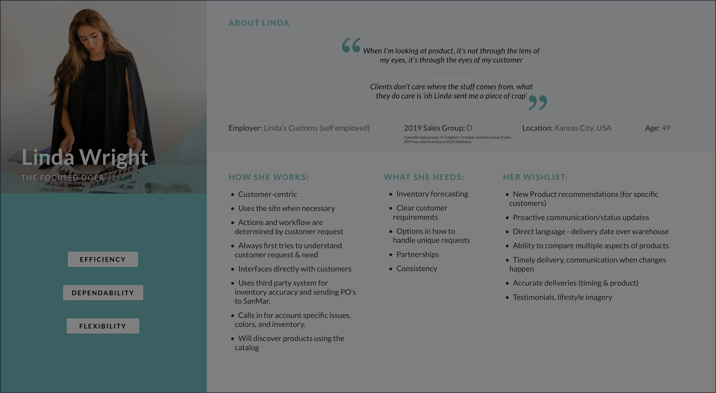
Web Redesign Focused on Tech Replatform & Integration
Business Overview
Zemax provides industry standard optical lens design software used by scientific researchers, mechanical engineers, and professors.
Problem Statement:
Zemax tools, community platform, and resources were all supported by different backend systems causing a poor and disjointed user experience for both internal users and customers alike.
Business Goals:
Reduce internal team’s time spent managing licensing and approvals when software is purchased. Increase community engagement for customers, and cut costs.
Process & Deliverables:
Stakeholder Research
UX Audit
User Research
Contextual Observation
User Flows
Technical Architecture
IA
Wireframes
Tools Used:
Pen & Paper
Google Meet, Drive, Docs, Sheets
Sketch & Figma
Zeplin
My Role:
Lead UX Designer
Starting Point
Stakeholder Interviews
I interviewed 6 individuals from Zemax including IT directors, marketing directors, and financial operation managers and uncovered several internal process issues causing unnecessary work and a poor customer purchasing experience. Findings include:
Customer Purchase Flow - Currently purchase and download systems are separated causing a poor user experience and unnecessary internal work during the internal approval process.
Consolidate Platforms - The knowledge base (resource for users), community, license manager, legal approvals, and purchase flows, all are supported by different backend platforms causing internal strain.
eCommerce Improvement Opportunities - There are a lot of checks and balances that need to happen for customers before they are legally allowed to use the software. This is to prevent potentially large issues with illegal use.
Platform Migration - Knowledge base content will need to live under a password protected area. Users are only allowed access to this content when they have been approved and completed purchase of a license and have an active license.
Technical Platform Integration - Integrations are used in the purchase flow and the experience for customers and internal teams need to be improved.
UX Audit Takeaways
User Flows: Information such as products and services offered, clear suggested directives, and intended users are not clearly communicated. Additionally, there may be some users who don’t necessarily identify with the current listed titles.
CTA’s: Primary, secondary, and tertiary CTA’s have not been established. It is unclear what actions will happen upon making a selection, video controls are inconsistently displayed, and expected action is not clearly communicated to the users.
Information Hierarchy Within Sections: Many individual sections are informationally redundant, inconsistently linked, while poor spacing between elements (especially on mobile) causes an unclear discovery path for users.
Search: The search experience on desktop uses unconventional hover states, indicating to users an action that is not actually being received by the system.
Identified Opportunities
• Provide value proposition within the context of customer types - start at top of funnel, then narrow. Examples provided: Sketch, Autodesk, Zendesk, IBM, and Docusign.
• Progressively disclose details and potential outcomes of product.
• Provide clear CTA language
• Reduce content redundancies
• Improve baseline search experience
User Interviews
I interviewed a total of 12 users with titles including optical engineers, optics professors, mechanical engineers, hardware designers, software developers and graduate students. From these interviews I distilled 3 unique categories of users and outlined their priorities:
Level 1 (Student): First-time zemax.com viewer. Maintains no prior knowledge of what Zemax is, what it is used for, or why they should care. They do not know what they need to solve their problems.
Priority: First-time viewers want to see themselves and their industry, application of product, and role on site.
Served By: An avenue for discovery.
Level 2 (Optical Engineer): Understands what Zemax is and how it interfaces with their work but needs further detail.
Priority: Answering specific questions - Does product x complete y task? Is software x compatible with y? How do I Purchase?
Served By: Intuitive paths to product detail (functionality, integrations, benefits, pricing), contact with Zemax, and community forums.
Level 3 (Professor): Power user of software. License manager for students and teams.
Priority: They already know what they are accessing the site for, and want to get in and get out with as little searching as possible.
Served By: Intuitive path to resources, account, knowledge base, forum, and support. Consolidate & simplify account information and actions.
Purchase & Checkout Flows
I focused on technical architecture recommendations within each of these flows in order to ensure the experience of both the customer & internal Zemax team would be seamless and integrated successfully. These considerations not only affected the customer experience, but the framework of approvals within the company.
IA & Technical Architecture
While being considerate of the above checkout and purchase flows, I also included technical considerations & platforms when creating the IA.
Wireframes
My priorities & key screens in the experience are included below and prototypes can be found here.
• Display target audiences early on in experience
• Support discovery of products & capabilities
• Answer technical questions surrounding capabilities
• Provide path to purchase & seamless download
• Easy access to knowledge base, community, & resources
Home
Product Landing Page
Account Management - Licenses
Account Management - Individual License
Account Management - Colleagues
Training
Resources
Search Results
Before
After
Outcomes & Metrics
• Zemax was acquired by ANSYS upon development
• Knowledge base engagement up 36%
• Community posting & engagement up 26%
• Optimized product discovery experience
• Automated license management - significantly less manual work approval work for internal team
• Increase in search usage & decrease in time spent on search results pages
More Case Studies

Employee Benefit Platform For Healthcare Provider
Client: First Choice Health

Web Discovery & Redesign for Internal Shared Resources Tool
Client: Fred Hutch
Web Discovery & Recommendation Backlog
Client: SanMar

Web Discovery & Redesign
Client: Swiss Water

Flight Itinerary Unification
Client: Expedia

Woodworking
Check out some of my personal projects